Your Colour Choices
Colour is so exciting. It can conjure up feelings of lightness and fun through to darkness and depression. Some of this is achieved by the balance of values which convey a heaviness or a lightness, in addition to the colour choices in themselves.
How do you like to choose colour?
I think many of us have instinctive colour preferences so even if we are aiming at conveying a mood with a painting some of those will be constants. What do you think is going to influence your choices as you work on your next body of work?
It could be that emotions will guide you to the main colours you decide on. Or memories. Or one of the four seasons. Or a painting that you've already created. Perhaps you'll decide to choose colours from a fashion shoot in Vogue. Or draw from sketchbook studies you've made.
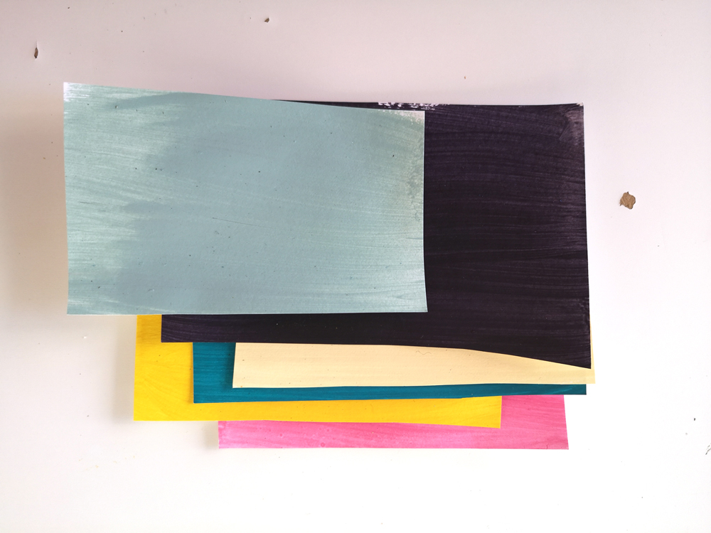
I looked at a large painting I made that ground to a halt and made a study of some of the colours I loved in it and you can see that colour study here stuck into my journal with masking tape.
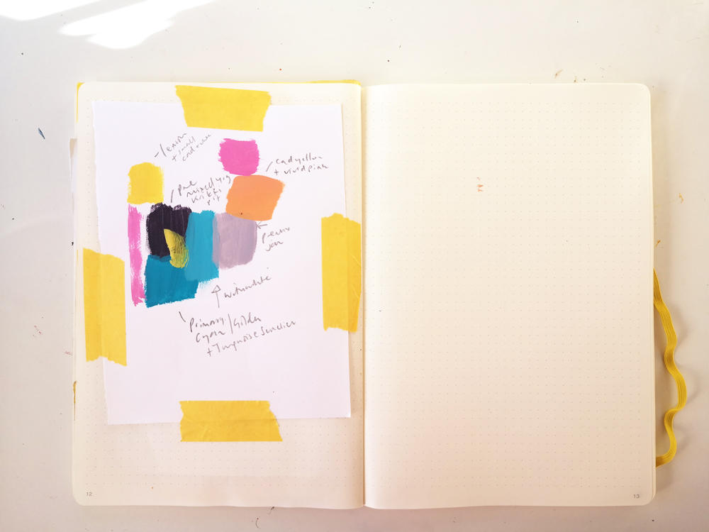
This is one potential colour palette that I could play with intermixing more later this week to see if I can settle on a definitive palette. When that orange is mixed with the blues, I'll get browns... greens when I intermix yellow and so on. As I write this I've done enough exploration to know that I'll continue to work with the palette I show you in the film.
You could also place limits on your range of colours which means you give yourself more chance of a sophisticated palette as the more you intermix a few colours the more they will harmonise. Or do what I ended up doing and make up quite a lot of colours knowing that you can pick as many or as few as you like for a painting. Orchestrating lots of colours while painting intuitively be tricky, which is why I want us to explore this aspect as much as possible in this preparation section.
So perhaps decide to keep it really simple using white, black (or your mixed alternative) and perhaps just two or three other colours that you can alter with any of your selection. A colour from the yellow family, one from the blue and one from the red. Or you could mix three of your favourites colours and go from there. This is a great way to concentrate on composition and value while experimenting with mark-making and you'll be amazed at just how many colours you can create from just these few. By the way, if you choose Golden's Primary Yellow, Primary Magenta and Primary Blue as your three to mix with white and black then the colours you can create are endless. I probably shouldn't have mentioned that!
Our knowledge of colour psychology and the things we associate with different colours probably enter our minds when we think about the palette we might use. Sometimes we are influenced consciously or subconsciously by trends as well. You could be really into fashion and this approach might appeal. If you're thinking seasonally, you may not want to use stereotypical seasonal colours; or colours that you associate with certain emotions might not be obvious. That's great! It makes you an individual. The only person who needs to be 100 % behind your choices is you.
Depending on the scale you will be working at and how intentional you want to be, you will either be:
mixing as you go from large blobs of paint on a palette/s with colours that are your staple go-to's
or you'll want to mix fresh new colours in sealable yoghurt pots or jars
or you'll want to start with a limited palette of 5 colours as explained just now
You can change your approach anytime or add an exciting random colour. Do what makes sense to you first.
I'll be taking the second approach because I'm deliberately aiming at a collection that sits well together by colour, though I suspect I will be narrowing it down and might drop that strong green!
Initially I'll play with different colour combinations on loose sheets of cartridge paper, moving to high-quality watercolour paper and then onto wood panels in a few sizes later in January. Having said that if I feel inspired by any works on paper as I am doing them I have enough wood available and prepared to work on that I can quickly lay some colours down on those.
Ideally you'll have some prepared surfaces about to work on if you're inspired at this point.
You might decide to deliberately choose a different palette daily and work fast on paper throughout for most of week 2 and decide just before week 3 which combination you prefer.
TIP: if you do commit to some colours to explore early on - when you come to gesso your surfaces with white, you could premix a neutral that contains all those colours with a large quantity of Gesso and use that to prime your canvas or wood. I have a small pot of gesso that's nearly finished that would be perfect for this so that's what I'll be doing this week too.
An optional exercise
If you haven't already devised your palette by looking at past work and are undecided, this is a fun way to help you choose colours that are perhaps natural to you:
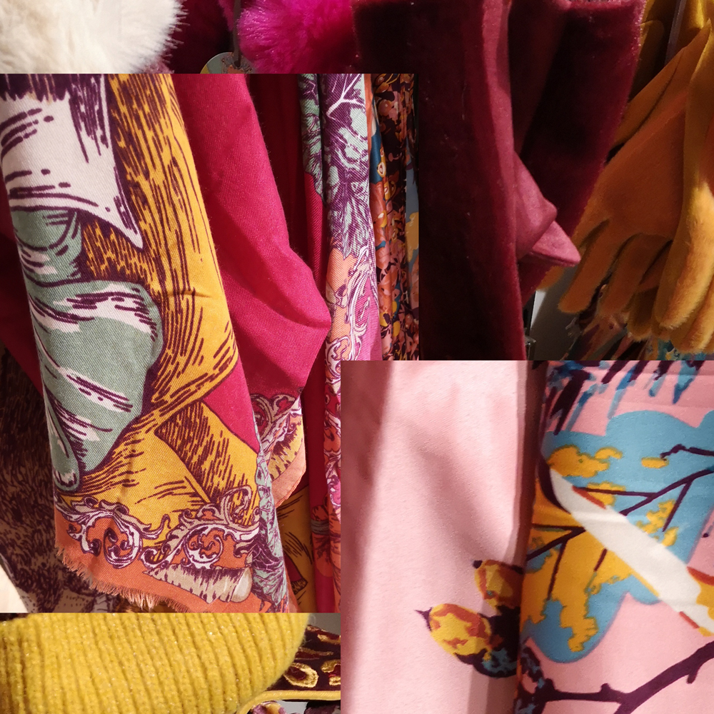
Look in your wardrobe. Season is going to affect what is inside.. but generally, if you're someone who is drawn to certain colours they'll appear no matter what the season. Check out your shoes, bags, scarves, even your sock drawer. Take photos of your favourites.
If you happen to be out shopping, take your phone and snap pictures of colours you find really attractive.
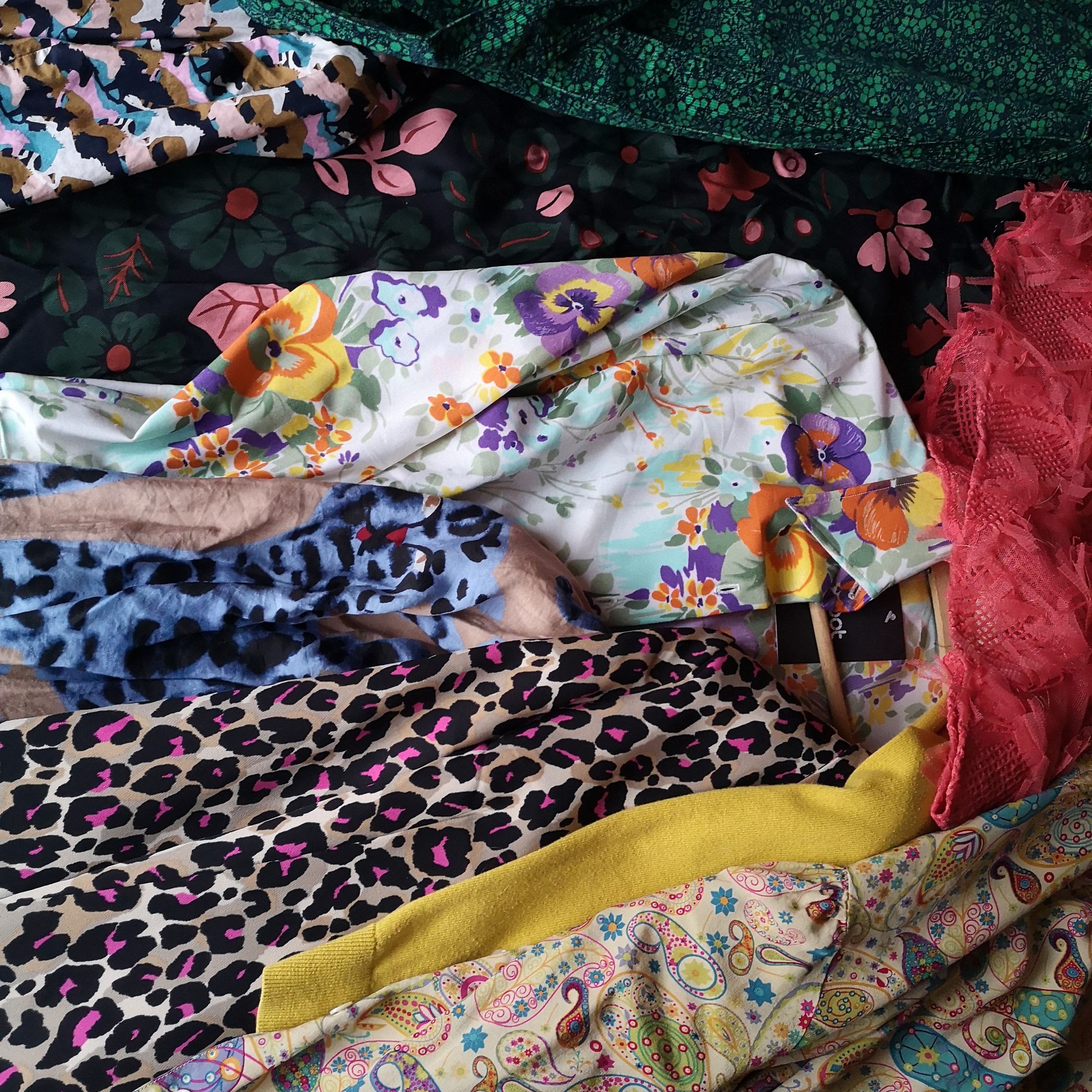
Here are a handful of my favourite clothes from my wardrobe on a very grey day and then a fast collage of some photos I took at a local department store recently. There are several crossovers aren't there? I hadn't planned to take photos when out shopping but I loved all those warm rich colours so much that I had to take some! See how that deep yellow works so well on that pale pink bottom right because of the dark aubergine and brown orange, without those colours - their depth; this combination would look insipid. The tonal values would be too close.
I know that yellow will feature in my collection, pinks ( as they always do ) and probably shades of blue and green...but I'm going to adventure with colour mixing this week to make small studies of other shades inspired by these images; helped by my journaling before I mix larger quantities of paint.
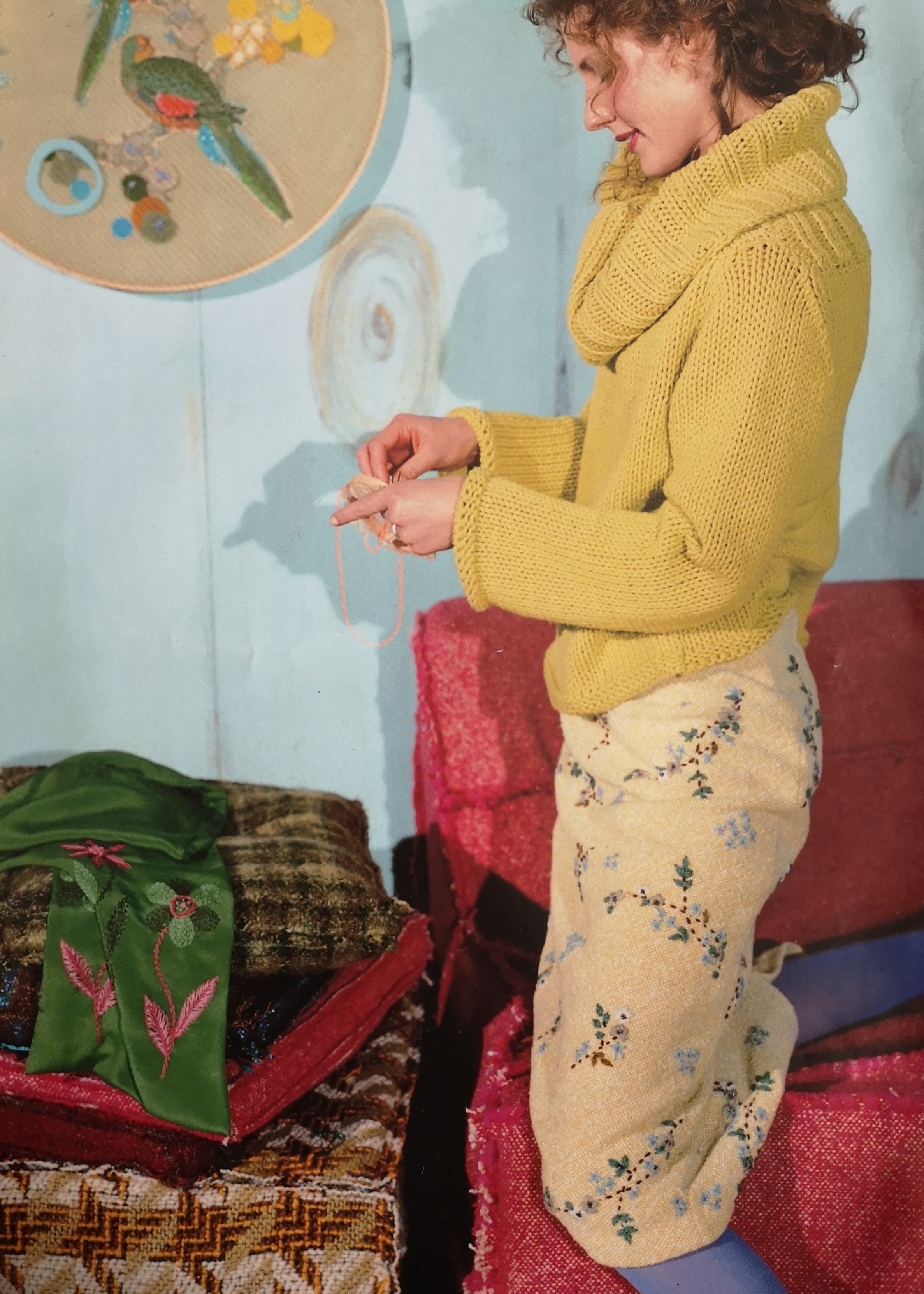
If you like to collect photographic inspiration from magazines or pinterest glance through gathered imagery and pull out any that jump out at you
This is a photograph I've had for years (it's from an Oilily brochure) and something about the colours is really calling me... they're apt for January when I am writing this - clearly the clothing etc are Winter and yet the colour palette makes me think of Spring - my favourite season. I think this is where I shall start; looking at my other photos the colours really are not very far removed!! I hope that you may discover something similar grabs you when you do this exercise.
Now's the time to mix up colours in pots or jars if you have found or decided on your palette; it can take a while.
Palette and composition exercise
Make colour studies in a sketchbook using colours you think you might want to use until you settle on at least a palette or two you want to work with. I did this on paper I've already stuck some old colour studies or sketches into my journal - in a very m essy way!
Now that I've decided to use the above photo as inspiration I'll mix colours loosely based on these and then intermix the colours further. I can't share those recipes exactly, partly because I'm adding to existing mixes, but also I don't want to because I really want you to discover your own colour preferences by mixing your own based on what you discover about yourself and your work.
When you find combinations you like, try them out by filling small squares or rectangles with different proportional balances of each colour - alternating the first colour and varying proportions to see if the atmosphere or your response changes to them. Continue until you feel confident that these are the colours you want to work with for the rest of the course (you can change your mind).
Take this exercise further by exploring small compositions in shape and colour and contrast of tone if you like. I'm using a5 scale pieces of paper for this. If your palette is still an issue then use a very dark colour, white, and a couple of other colours you're drawn to and intermix them. Of course, if you have an "ingredients list" you could incorporate ideas from this too, into the small paintings.
The main thing for this week is to realise what you want your own objectives for this time together to be; what resonates with you now about your own painting and that you've settled on a palette to begin work with. Make swatches if it helps:
You're deciding to allow your painting to emerge through mistakes and bravely painting in a way that might be very new to you. Have patience and embrace the unknown. As you have seen - I made plenty of ugly scribbly little paintings which enabled me to spot a couple of colour combinations that I want to explore.
For all of us at least one very dark value will be important for contrast to draw and hold a viewers attention. A good quality white paint like Golden Acrylic - Titanium white is great for creating light and opaque tones with all other colours. Cheaper ones can sometimes be too transparent to mix with - if you want opacity!
If you'd like to share any discoveries so far and any 'aha's' you've had about your next body of work I'd love to see them in the Facebook group - perhaps with a few images of your past work that relate to the discoveries.
If you want to launch further into your own painting experiments before next week please do. If you're feeling inspired, don't wait! Make the most of the time you have and go wild!!